ShopDreamUp AI ArtDreamUp
Deviation Actions
The Chronicles of Cosmic Wisdom
Embark on an odyssey through the epochs, tracing the footsteps of the great minds who sculpted the narrative of scientific eras. "Chronicles of Cosmic Wisdom" invites you to a soiree that transcends time—an enlightening exploration of the luminaries from Thales of Miletus to the quantum visionaries of our age. This tier is not just an educational endeavor; it's a poetic journey, an elegant quest where the pages of scientific sagas unfold.
$23/month


Suggested Deviants


Suggested Collections


You Might Like…


Featured in Groups


Description
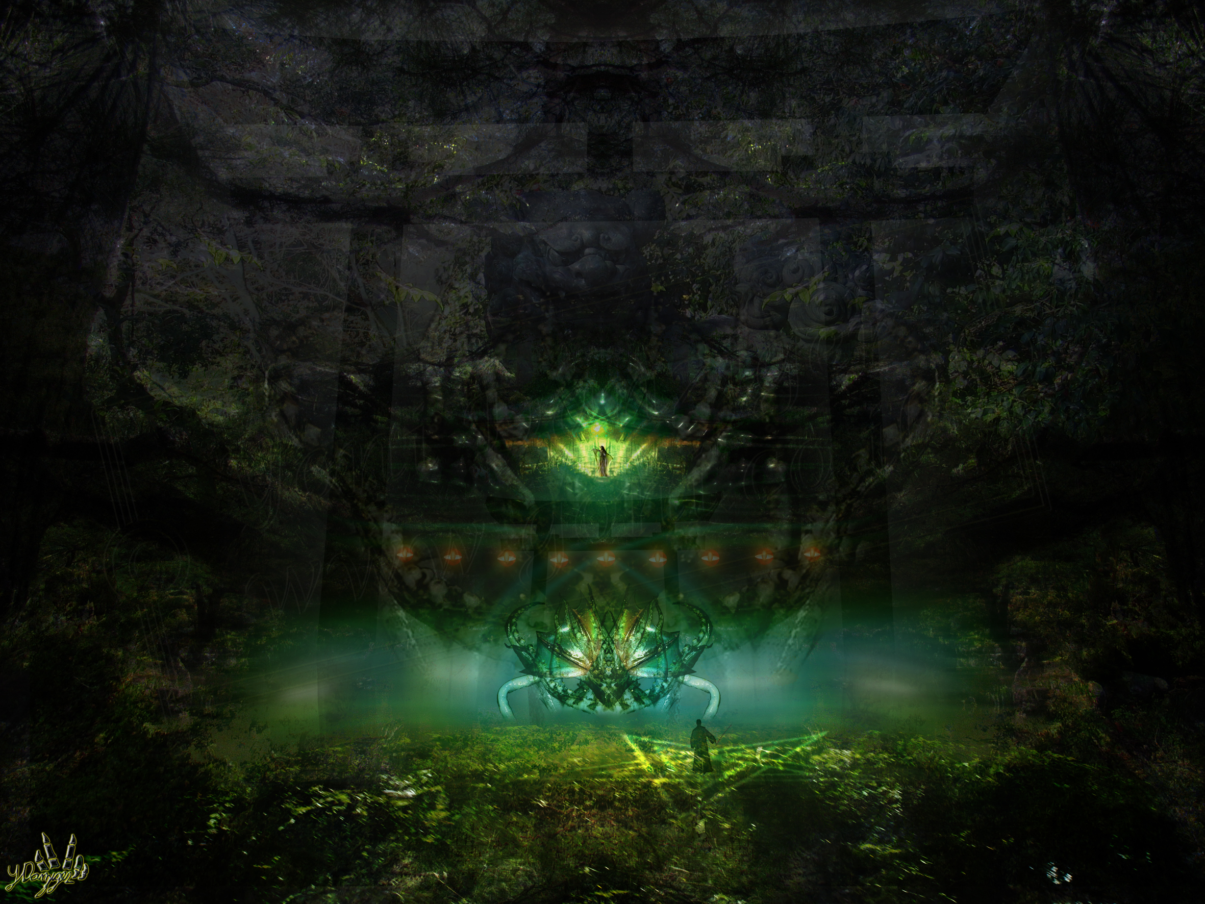
The Shrine Maiden
Digital work from scratch (All resources are mine)
2011


Do not copy or use this piece!
(Please view at full size)
At the early of 2010 I made an experimental piece that spoke about a broken heart...
An impossible love between a Japanese warrior and a Shrine Maiden,
that was destroyed because of the warriors' betrayal.
This was the piece
Now this new piece (about 3 months of painting), describes what has become afterwords...
The Shrine maiden has gone evil, and her soul desire
is to erase the warrior (her x lover) from existence
Enjoy!
Digital work from scratch (All resources are mine)
2011
Do not copy or use this piece!
(Please view at full size)
At the early of 2010 I made an experimental piece that spoke about a broken heart...
An impossible love between a Japanese warrior and a Shrine Maiden,
that was destroyed because of the warriors' betrayal.
This was the piece
Now this new piece (about 3 months of painting), describes what has become afterwords...
The Shrine maiden has gone evil, and her soul desire
is to erase the warrior (her x lover) from existence
Enjoy!
Image size
2362x1772px 2.89 MB
Make
Canon
Model
Canon PowerShot G5
Shutter Speed
1/50 second
Aperture
F/3.5
Focal Length
7 mm
Date Taken
Apr 20, 2006, 8:15:58 AM
Sensor Size
6mm
Comments103
Join the community to add your comment. Already a deviant? Log In
To start, I'll say that my critique will be based on my knowledge as a digital visual effects artist, and not as a traditional artist.
I like the concept and mood, and it has a nice color scheme. However, I don't think this is your strongest piece, technically or artistically, and you know I like your work, I hope you take this as constructive criticism.
There seems to be a strong light source in the center, but the character casts no shadow from that source, and there's no real light being cast on him either. The piece is very vast, so the focal point is very small and hard to get a look at; if you're not looking for him you can easily miss the character in the lower portion of the piece. I love the design of the woman in the center, but she's too small in my opinion for such an important part of the piece.
I don't understand the graphic overlay that's over the whole piece. Your blurs are also inconsistent on your elements, some things in the background are sharper than foreground elements, some elements right next to each other have different blur qualities, etc.
It's a cool idea, and a decent execution, but I've seen you do better. I hope this is helpful, and I look forward to seeing more of your work.